
Inessens pushes back the boundaries of design by offering the possibility of superimposing several labels of the same or different materials on the same label. From a graphic point of view, this opens up a whole world of possibilities and extremely innovative concepts. These combinations make it possible to play with textures, transparency and depth effects to create unique and striking designs. The ultimate aim, of course, is to catch consumers’ eyes and stand out from the crowd.
Synthetics and paper: modernity and depth of field
Combining polypropylene, renowned for its strength and transparency, with paper, which adds a more natural, textured touch, paves the way for sophisticated, differentiating labels. This combination makes it possible to create a play of light and transparency that enhances the aesthetic appeal of the label.
With this in mind, Inessens has developed a unique innovation: ‘floating’ hot foil stamping. The paper label is first cut or perforated and then applied to a transparent label, giving the illusion that the foil printed on the transparent label is in suspension, giving a ‘floating’ effect. Thanks to this window, the consumer can appreciate the colour of the product through the bottle or flask.
Another solution proposed by Inessens is to laminate (superimpose) a textured paper label onto a transparent label printed in window graphics. The double-sided effect is stunning, offering a larger communication surface and the possibility of creating an atmosphere around the product.
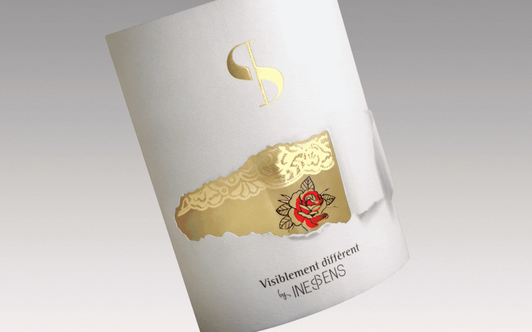
Metallics and paper: the incomparable richness of gold
In the world of perfumery, to meet the expectations of our customers who want a premium finish for their packaging, we offer to laminate a gold backing to a label printed on textured paper. In this way, the reverse side of the label, which can be seen through, remains premium. The gold backing will give the product a lovely warm glow, enhancing the atmosphere created around the product and the brand image.
Paper and wood: authentic and natural
Incorporating wood into the label, overlaid with paper, gives it a natural, top-of-the-range look. On a premium or limited edition product, the wood label adds a sense of exclusivity. This combination is particularly popular for products that promote authenticity and respect for the environment. When it comes to design, it’s advisable to opt for a streamlined look and use raw materials rather than bright colours.
A concrete example of this innovation is illustrated by the Eco 7 label. It features a subtle blend of textured, moulded paper and the number 7 precision-cut from real wood, in this case birch, which is laminated and glued to an adhesive backing.
Paper on paper: volume and contrast
Superimposing different layers of paper allows you to play with levels, cut-outs and shadows. This technique adds depth and highlights graphic or textual elements with elegance. By playing with weights and finishes, it’s possible to achieve a particularly seductive tactile and visual effect, as in the case of our Inessens flower, which represents hand-sewn elegance. Since we could create a label with two substrates one under the other, we decided to go one step further by creating labels where the materials would be superimposed to create volume and perspective.
At Inessens, we push the boundaries of innovation to enhance your labels and add a new dimension to your brand image. Contact us to find out how these techniques can enhance your products.